
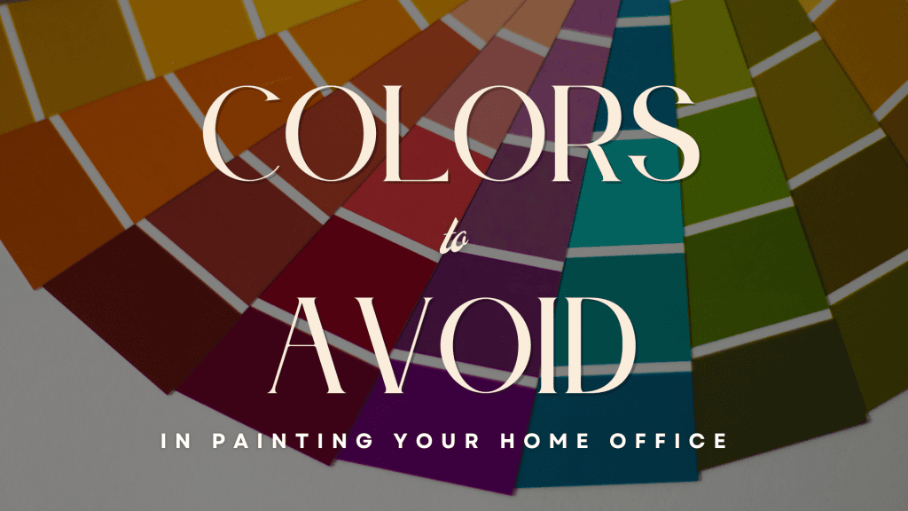
Colors To Avoid In Painting Your Home Office in Tonkawa, OK
Your home office is more than just a workspace—it’s where focus, motivation, and comfort fuel your productivity.
Surprisingly, the color you choose can greatly influence your mood and efficiency – while some hues foster creativity and calm, others can distract or drain you.
To help you come up with the right choices, here is a list of Colors to Avoid in Painting Your Home Office.
1. Overly Bright or Neon Colors
Bright and neon shades, like electric yellow, neon green, or hot pink, might seem fun and energizing at first glance, but they can quickly become overwhelming in an office workspace.
Why Avoid:
Neon and intensely bright colors will be jarring to put as the main color of any space, making for an extremely visually unappealing room.
In this case, choosing such a color can cause visual fatigue, making it hard to focus and ultimately defeating the purpose of creating a productive workspace.
Better Alternatives:
You’ll want to opt for muted, toned-down shades of these colors.
For example, if you’re particularly drawn to a certain bright shade of yellow, you might want to reconsider opting for a softer shade like mustard or light lemon.
This way, you get to have that exciting vibe you get out of the color yellow but without the chaotic and overstimulated feel.
2. Dark or Moody Tones
Deep shades like navy blue, charcoal gray, or black can look sophisticated and dramatic, but they’re not always the best fit for a home office.
Why Avoid:
Dark tones absorb light, which can make your office feel smaller, dimmer, and more confined.
This is particularly problematic if your workspace lacks natural light or is already on the smaller side.
With the limited space, opting for a dark color might confine the space, making your office feel cramped and gloomy – which doesn’t really encourage focus nor creativity.
Better Alternatives:
If you do have a limited office space, you should veer away from dark colors and opt for light colors.
This way, you get to open up the space and take advantage of the energy the extra light will bring to your space, and convert that into productivity.
This is because brighter spaces naturally feel more energizing and welcoming, helping you stay motivated through times when work seems endless!
3. Pure White
When it comes to home improvement and painting projects, white is often seen as a safe choice – and coming off from the previous one, nothing could go wrong with this choice, right?
Why Avoid:
While white can feel clean and crisp, it can also create a stark, sterile atmosphere that lacks warmth and inspiration, especially if you’re using a particularly cold and pure shade of white.
Over time, this cold environment may make the space feel uninviting and uninspiring, which isn’t ideal for productivity.
Better Alternatives:
Instead of stark white, consider off-whites with subtle undertones.
Warm whites with hints of beige or cream can make your office feel cozy and inviting, while cool whites with gray undertones work well in modern spaces without feeling too harsh.
Adding a touch of warmth to your white walls can make your workspace more comfortable and visually appealing, helping you feel at ease while you work.
4. Overly Vibrant Reds
While red is definitely a bold and striking shade associated with energy and intensity, painting your home office space with a particularly vibrant shade of red will not be a great idea.
Why Avoid:
Red’s stimulating nature, especially a bright shade of red, can evoke feelings of stress, urgency, or even aggression when used excessively.
This can make it difficult to relax and focus, especially during high-pressure workdays.
Better Alternatives:
If you’re particularly drawn to the allure of red, you might want to consider incorporating the color in small accents, rather than using it as a dominant wall color.
If you love the warmth of red, incorporate it in small accents rather than using it as a dominant wall color.
A muted terracotta or soft burgundy can bring a touch of energy without overwhelming the space.
Balancing bold colors like red with neutral tones ensures your workspace stays harmonious and focused.
5. Trendy Colors
Trendy colors like bright teal, magenta, or orange might be appealing now, but they’re not always practical for a home office.
Why Avoid:
These bold and statement-making shades can quickly become distracting and may clash with your furniture or decor.
Additionally, trendy colors often fall out of style, leaving your office feeling outdated faster than you might expect.
Better Alternatives:
Stick with timeless, versatile hues, since they are easier to coordinate with other design elements and helps your office remain functional and fresh, even as trends evolve.
For example, soft greens, muted blues, and neutrals like taupe or greige create a sophisticated and versatile workspace that will feel stylish in the long run.
At Watermark Painting & Drywall, we specialize in handling all your residential & commercial painting needs.
We do decorative cabinet painting, wall and texture resurfacing, wallpaper removal, carpentry, and home repair.
If you need painting assistance, let us strike up a conversation at 580-763-2593, and let us schedule your free estimate!
Related: How To Repair and Paint Over A Damaged Roof Surface in Tonkawa, OK
Guide To Avoid Mess In Painting Your Kitchen Cabinets in Ponca City, OK